Tuesday, August 21, 2012

Tupac Shakur (August 2012)

This may be my last one for a while since I'm about to move to Tampa, FL to start my new job.  I've been wanting to revisit Tupac for a while now (especially since I've been listening to his music so much lately), and this seemed like the perfect opportunity.  So much of Tupac's lyrics contain prophetic words-- particularly songs like "Keep Ya Head Up" that offer critiques of modern society's willingness to turn its back on folks.  Of course, on the flip side, there's a lot of violence in Tupac's story, so I feel like a phrase coined by my friend Daniel Johnson applies well: he was undeniably called, but he certainly made mistakes in living out that call.

Pursuing that prophetic theme, I decided to do a sunburst pattern in the background in imitation of stained glass.  The red, white, and blue have multiple possible connotations, but I honestly just picked them because they created a nice triad with the yellow/orange/brown tones on Tupac himself.  I leave the symbolism of these color choices to the observer.

Of course, one reason I really loved working on this piece was that I finally got to experiment with realistic skin tone.  People have often asked me about the reasons for my color choices ("Yes, but why is she green?  What does that mean?"), and the truth is usually disappointing: I just don't have any flesh tone post-its!  With Tupac, using a range of yellows through browns, I was actually able to develop something that resembled his actual skin tone, and now I'm excited to use this color palette again (you know, once I get settled into my new job).

Tuesday, August 14, 2012

Duck Dunn Portrait donated to Stax Museum

It's still pending a vote by their executive board, but I've dropped off the post-it portrait of Duck Dunn at the Stax Museum of American Soul Music!  There's a chance it might not be entered into the museum's permanent collection (i.e. the exhibit itself), but if that's the case, they assured me it would go somewhere in the building or possibly even to Duck's wife, June.  The Stax Museum and Stax Music Academy are awesome causes, and I'm stoked to be able to make this contribution!

Also, you can click here to see how this portrait was made.

Monday, July 23, 2012

Monsters of Classic Cinema (July 2012)

I wanted to do something a little goofy.  Continuing the theme of classic film, I decided to take a look at some of the best bad guys in film history: old school monsters.  Also, just for kicks, I decided to do sort of a Warhol thing and ditch the black-and-white in favor of full color.

Count Dracula
Dracula (1931)
portrayed by Bela Lugosi

Frankenstein's Monster
Frankenstein (1931)
portrayed by Boris Karloff

Larry Talbot/The Wolf Man
The Wolf Man (1941)
portrayed by Lon Chaney, Jr.

The Creature/Gill-man
Creature from the Black Lagoon (1951)
portrayed by Ben Chapman and Ricou Browning


Also, I had some supplies that I needed to use up before my next move, so here's this.  I used images of Buddy Holly for inspiration along with a tip of the hat to the Doctor Who 3D glasses bit:


Tuesday, July 17, 2012

Stream of Consciousness (July 2012)

This one probably has some sort of deeper meaning, but I'm not completely sure what it is-- perhaps something to do with the fleetingness of thoughts and dreams?  The woman depicted here is Martha Vickers, a noted actress, model, and WWII pin-up girl who is probably best remembered for playing Lauren Bacall's trouble-making younger sister in the classic Bogey/Bacall film noir, The Big Sleep.  One of the things I sought to do with this piece was exploit the wide range of blue tones available in post-it notes, and while I think I accomplished this, a few of the shades did sort of run together (creating a lower contrast image than I would have preferred).  Still, I'm pretty pleased with it.

I'll also add a close-up here where the different blue tones are a little more apparent.  Now that I think of it, I ran into a similar problem with the Duck Dunn portrait a few weeks back.  Yep, there are about seven different shades of blue available in post-its, but the contrast between them isn't quite as high as I'd like.  It'll do though.

Sunday, July 15, 2012

The Boy Wonder (July 2012)

I'm on a bit of a comicbook kick lately, so it seemed like an appropriate time to capture one of my favorite superheroes using the post-it medium.  Yep, even though I'm a huge Batman fan, Robin has always seemed like the more interesting character to me.

A little backstory: Dick Grayson is an orphan who Batman takes under his wing, and one of the recurring themes throughout comics and cartoons is that Batman is attempting to spare his young protege from the same neglect and bloodlust that have made Batman the vengeful, bitter man that he is today.  Of course, Robin does his fair share of brooding as well, but he's ultimately a fairly lighthearted character, making the contrast to his mentor all the more stark.  In this piece, I tried to capture some of those more Batman-like tendencies (exemplified by the bat signal present in the background and the darkness obscuring Robin's face).

Of course, speaking of Robin's similarities and departures from Batman, it just hit me how much this post-it imitates the style of the old "Batman: The Animated Series" title card.  That was completely unintentional, but I'm glad it turned out that way.  That show had a phenomenal visual style that stirred in elements of comicbooks, art deco, and film noir sensibilities, so I count any similarity to it (no matter how accidental) as a good thing.
[sigh]  I know.  I am such a comic nerd.

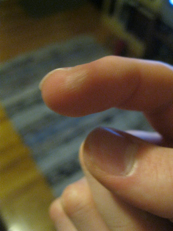
In other news, I burned my index finger tonight while fiddling with a candle, so this may limit my post-it work for a bit.  I put aloe on it right after it happen, so maybe that will keep it from blistering up and I'll be able to work again tomorrow.  I'd cross my fingers, but that kind of hurts right now.

Morpheus (July 2012)

I needed a break from the hyper-detailed stuff and wanted to pay homage to Neil Gaiman's The Sandman (in which I'm currently engrossed), so here's Morpheus the Dream Lord.

Veronica Lake (July 2012)

I have kind of a fascination with 1940s-era actresses.  The "NOIR!" series was kind of an outgrowth of that, and this piece continues that theme.  There's just something about the movies of that era-- the barb-laden dialogue, the constant double crosses, the competent and complex female characters.  It's a pretty stark contrast to the more action/sex-obsessed films of today.  I digress.

The woman in this piece is Veronica Lake, and you might recognize her as the inspiration for Jessica Rabbit.  You know that iconic hair-over-one-eye look that actresses, models, and musicians have been using for years?  Yeah, Veronica Lake invented that.  More importantly though, she was a highly versatile actress.  Her first leading role was actually in a poignant comedy (Sullivan's Travels), but she could play the femme fatale and a slew of other characters as well.  Despite a rather turbulent personal life and a reputation for being temperamental, she was a reliably gifted actress who --in the words of director Rene Clair-- didn't believe she was gifted.

Also, fun fact: Veronica Lake was often cast next to actor Alan Ladd, but the pairing wasn't just about their on-screen chemistry.  An underlying factor was that Ladd stood only 5'5", and the 4'11" Lake was one of the few actresses next to whom he looked tall.

So there you have it: Veronica Lake-- gifted actress, enduring icon, totally post-it worthy.