Monday, March 26, 2012

Post-Its for New Creation Art Show (March, 2012)

My most recent post-its are admittedly a little darker in subject matter.  In particular, these are two pieces that I produced over Spring Break for a collection of offerings from Duke's New Creation Arts Group.

The first is called "Good Friday," and unlike many of the images I work with, I had a very clear goal in mind for the symbolic elements here.  The brokenness of the church has been a fixation of mine lately, and the idea of Christ's Body being torn apart through schism has been a recurring image in my mind.  I incorporated the red sun in the background to convey a sense of absolute suffering (like that of Christ on the cross), and the face in the foreground is a traditional portrait of Christ that I have subverted a bit by pulling it apart.  There's a pretty lengthy story behind this piece really, so if you're curious to learn more, feel free to seek me out around the Divinity School or email me at tom.lewis@duke.edu.  I already have a buyer lined up for this piece.

The second is an untitled crucifixion scene where I was toying with a new technique.  I've always been impressed by pointillism (a style where artists use tiny dots of color rather than blends and brush strokes), so I thought I would apply that idea to the post-it medium.  I decided to keep things fairly abstract, making only the most basic form of a human body recognizable, and I wanted to make a point of using a wide variety of flesh tones in the image, so I created a full color palate using all the notes I had available.  I still consider both this piece and the new style to be works in progress, but with this new approach to post-it color matching, there's now a chance that I may be able to do something in the near future that I've never attempted before: realistic coloration.  I'll keep updating here as this develops.

Monday, March 12, 2012

Duke Divinity School History Panels (Spring 2012)

Over the past couple of years, I've gotten pretty handy with GiMP (Gnu Image Manipulation Program-- pretty much a poor man's Photoshop).  Part of my job over the past year has been the construction of a series of photographic history panels for Duke Divinity School using this program, and I think the results turned out pretty well.  The original files are far too large for the blog, but here is a version with lowered resolution:

These panels represent (from left to right): The Founding of Duke University School of Religion, Duke Chapel, the Gray Building, York Chapel, the Langford Building, Goodson Chapel, and the Westrbook Building.  Note the alternating pattern of architectural/academic panels with open spaces of worship.

Also, here are a few photos of the installation:


For any potential employers out there interested in viewing full resolution digital copies of these images, feel free to contact me, and I'll be happy to send samples your way.

Sunday, February 19, 2012

Additional Pieces from 2010 Exhibit (Fall 2010)

In addition to the explicitly religious works, the exhibit also featured some pieces that were just fun.

Portrait of Pablo Picasso.  Now in the collection of Gillian Lisenby Walters.

A rather intense self-portrait

Untitled.  There has been much speculation as to the meaning behind this piece.  I intend to let the speculation continue.

Resistance Fist.  The red bracelet is designed to resemble the bracelets made by a group young women rescued from sex slavery in Nepal.  For information on donating to groups like this one, visit the website of 1040 Connections.

Superman.  For this piece, I experimented with a new technique involving shredding the post-its down to an absolutely tiny scale.  The piece at right is only about the size of a sheet of notebook paper.  It is currently in the collection of comic book aficionado and songwriter Gary Mitchell.

Boba Fett.  Now in the collection of Morgan Hendrix.

Chess Pieces.  This piece was done with my own family in mind.  We're chess nerds.

Lady Liberty.  A revisiting of an early version of the stylized Statue of Liberty.

The Pineapple.  Now that I think of it, I have no idea where this piece is.  It might still be in my collection somewhere.

Sunsets.  Another piece that has been left somewhat intentionally ambiguous.  Some viewers have found it playful.  Others find it melancholy.  It's one that I enjoy hearing people interpret.

Religious Works from Post-It Exhibit (Fall 2010)

Back in the fall of 2010, I had the honor of putting several of my works on display in the hallways of Duke Divinity.  Not all of them were explicitly religious, but I thought I'd highlight a few that had very clear religious intent:

Madonna with Child.  Now in the collection of Dr. Dave Moffitt.

A portrait of St. Augustine based on a Tiffany window of the famous North African saint and theologian.  Now in the collection of Duke Divinity Admissions.

The Lion.  Some have interpreted this as the Lion of Judah.  Others have suggested that it is Aslan from the Chronicles of Narnia.  I like to leave it open for interpretation.  Now in the collection of Heather Moffitt.


The Old Crusader-- I went through some difficult times during my first year of div school, and this image popped into my head quite a bit during that time.  I see it as a reminder not to try to carry our crosses alone, but rather, to rely on Christian community and the uplifting power of the Holy Spirit in difficult times.


I'm a bit of a Dante nut, so I wanted to depict Dante and Virgil somewhere in the exhibit.  This is the only piece in the exhibit not made entirely from post-its, as the lettering in the upper right was done with pen and ink and bears the famous caption over the gates of Hell: "Abandon hope all ye who enter here."  The piece is now in the collection of Bradley Lisk.

A portrait of Jeff Buckley in a slightly abstract style featuring one of the most famous words he ever sang.  Now in the collection of Sarah Stockton Howell.

The Phoenix.  For more on the significance of this piece, see "The Phoenix Prayer" from the 8,000 Miles blog.  Currently in the collection of Jon and Alyssa Lawrence.

A Trinitarian Reading of Pentecost.  This was one of the larger pieces in the exhibit and features twelve paper-doll apostles with tongues of fire in their halos.

Tuesday, February 14, 2012

Argonautica (Summer 2008)

In the summer of 2008, my friend Prof. Michael Barich of Kenyon College approached me about illustrating his book, a new translation of Valerius Flaccus's Argonautica (the classic tale of Jason and the Argonauts).  I worked closely with Prof. Barich on the illustrations, and the book is available for purchase via amazon.com or through the publisher's website.

Inspired by traditional Greek pottery and statuary, the cover is a post-it mosaic featuring busts of Jason and Medea in front of the Argo and the Golden Fleece.  The inside of the book features pen-and-ink illustrations and a map depicting the journey of the Argo.  I have a few copies that I can loan out on request if you'd like a closer look.

NOIR! (Summer 2010)


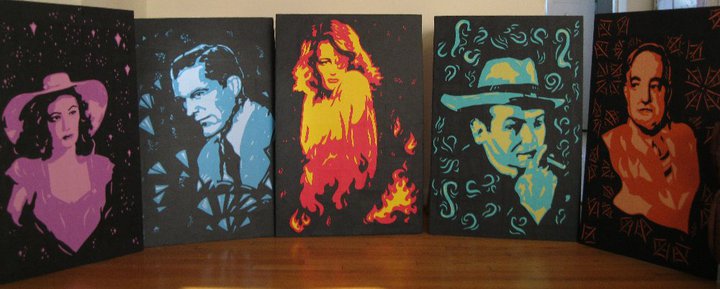
Probably the most photo-realistic portraits I've been able to make in the post-it medium, the NOIR! portraits represent a combination of digital imaging and stencil work applied to the standard post-it mosaic format.  Each portrait was designed using a block-by-block grid system similar in nature to a reduction print, and the five portraits together took an entire summer to produce.  The figures are all classic film stars, and each represents a standard character from the dark and gritty world of film noir.

The Femme Fatale
(Gene Tierney)

The Hard-Boiled Private Eye
(Dana Andrews)

The Starry-Eyed Heiress
(Jane Greer)

The Sinister Gangster
(Edward G. Robinson)

The Reclusive, Eccentric Billionaire
(Sydney Greenstreet)

Because these portraits are so interconnected, this is a set that I don't want to see broken up, so until I find a buyer willing to invest in all five, they will remain in my collection.

Monday, February 13, 2012

Post-It Jesus 2.0 (March 2010)

Produced for the New Creation Arts Group's 2010 juried arts exhibit (the theme of which was "The End of Words"), this piece was originally titled "The Incarnation" but quickly received the shorthand of "Post-It Note Jesus."  Based on the standard pantokrator style of Christ icon, this piece might very well be the most interesting thing I've really done with the medium.  Aside from its clear similarities to the first Post-It Jesus, the piece also combines the block-note format of earlier mosaics with the more intricate stencil work in my more recent projects.  Even though the piece didn't win, it did help me get my name out there as an artist at Duke, and it has since been featured in Divinity magazine as well as on the promotional material for the exhibit in which it was first displayed.

Now, even though I'm trying not to write too much in this portfolio, there's a heck of a story behind this one, so I think I'll go ahead and share it . . .

I hate to admit it, but, much like the first Post-It Jesus, the initial motivation for this one had quite a bit to do with impressing a girl.  More specifically, it had to do with proving to a girl that I was more artistic than my rival for her affections.  Of course, if there's one thing I've learned over the years, it's that God has a funny way of turning things around on us, and sometimes something that started with the worst intentions can become something holy.  I think this piece is definitely such a case.  The center panel was actually completed in one flurry of an afternoon with most of the cutting being done with scissors instead of a stenciling knife (as this panel is very much in the blocked style of the earlier pieces but considerably more abstract than most of my projects).

I decided early on to make this piece a triptych, but then I was faced with a dilemma: what should be on the two side panels?  Initially, I thought about putting in portraits of saints, but this detracted too much from the image of Christ, so for a period of weeks, I was stuck with these two massive half-completed panels sitting on either side of my imitation-icon.  Eventually, inspiration did strike, but it was in an incredibly unlikely way: food poisoning.

I ate Sitar (the campus's Indian cuisine) for lunch one day and enjoyed a delightful samosa, but within a few hours, I had an unbelievable headache and stomachache.  The world around me was getting a little blurry, and I was starting to sweat a good bit.  Even though I initially wanted to tough it out through my afternoon classes, a few friends convinced me that the smarter decision was to go home and rest; they would hand in my work and take notes for me.

After an exceedingly wobbly bus ride back to my apartment, I collapsed into bed and entered a feverish sleep, and it was in this sleep that I had a dream:

In my dream, I was sitting on the couch in my living room, and I had the side panels laid out on the coffee table in front of me.  Just like always, I was wracking my brain trying to figure out what to put on them, but then a familiar figure burst into the room.  It was none other than Doug Campbell, my New Testament professor!  Dr. Campbell had apparently ridden his bike over to my apartment as he was sweating profusely and wearing athletic attire, and he was pointing erratically at the panels and speaking enthusiastically in what sounded to me like absolute gibberish.

I'm still not sure if it was supposed to be glossolalia or just a particularly thick version of his usual New Zealand accent, but either way, I couldn't understand what he was saying.  Finally, the imaginary version of my professor gave up and started pantomiming everything for me, and I managed to wrap my mind around what he was trying to say: fill up the space in the panels with tableau scenes from the life of Christ.  Okay, that's great, Dr. Campbell, but which ones?  Look to the Gospel of John!  Huh?  What does that mean?  Oh, wait, I think I've got it!

With that, I woke up out of my dream, and even though I was still feverish and loopy and barely containing the contents of my stomach, I knew what I had to do.  I lurched for my stenciling knife and got to work.  Several hours later, I had filled my side panels with scenes of Christ's baptism, walking on water, telling parables, and the crucifixion-- all of it framed by the words "In the beginning was the Word" in Greek.

And that's the story of the second Post-It Note Jesus.  Did I win the competition?  No.  Did I get the girl?  Also no.  Did I learn a lot about myself and wind up spending a surprising amount of time nurturing my relationship with God because of this thing?  Yep.  The piece was ultimately divided between two owners with my friend Kate Flynn taking the side panels and my friend Brad Hinton taking the center image.